The best visualizations are easy to understand, informative and eye catching. After combing through dozens of our articles on everything from the world’s economy, to the stock market and price changes, we picked the top 10 visualizations from 2019.

In case you’re a new reader, our mission is to make understanding money simple and easy. The goal is to present useful information in a beautiful way to help people make sense of the business world. These are the best examples from the last year. We hope you enjoy our countdown.
10. Are Taxpayers in Your State Giving More Money to the Feds than They Get Back?

There are two things certain in life: death and taxes. One way to think about federal taxes is by analyzing how the government divides the pool of resources and sends money back to the states. It turns out some places like Virginia and Kentucky receive significantly more in federal outlays than they contribute, and some states get back only a small share of what they pay, like Connecticut and New Jersey.
9. Price Changes Over the Last 20 Years Prove the Economy is Rigged

Is the economy rigged? This visualization illustrates how the odds are stacked against people trying to join the upper class. Education and healthcare have become increasingly expensive over time, but things like televisions, cellphones and toys have gotten cheaper. That means it’s gotten cheaper to sit in front of screens instead of getting a degree, or staying healthy.
8. A Snapshot of Tourist Spending Around the Globe

Tourism means big business, even in countries where you least expect it. This map shows how some places benefit much more than others on tourist spending. The U.S., Europe and a few countries in Asia like Japan and Macao dominate global expenditures, while all of Africa misses out.
7. How Big is Apple? This Visualization Puts Things Into Perspective

Big companies got even bigger in 2019, and Apple was no exception. But just how massive is Apple? The company’s market cap is bigger than the combined GDP of 25 African countries. It’s more than the entire budget for the U.S. Department of Defense. And it’s more than the total net worth of the world’s top 5 billionaires. In short, Apple’s really, really big.
6. Mapped: Who Owns the World’s Gold Reserves

Gold is the ultimate way to store value. You can objectively measure it, everyone thinks its valuable, and the world has a finite amount of it. All of which means that the countries that control the world’s gold reserves are in a prime position to dominate the economy. Indeed, our visualization makes clear how the U.S. and European countries like Germany and Italy control most of the world’s most precious metal.
5. Visualizing the Highest-Paid Job in Every State

Our map of the highest paying jobs in the country indicate one thing: if you want to be rich, become a doctor. There isn’t much difference in take-home pay no matter where doctors live. They usually bring home between $250k and $390k. The only exceptions are in places like Puerto Rico and the Virgin Islands, where doctors can still make north of six figures.
4. How Much Does a Pint of Beer Cost Around the World?

Want an interesting way to compare the cost of living around the world? Consider our map of how much a pint of beer costs in dozens of major cities. Drinkers can expect to pay the most for a pint in Hong Kong, China ($10.86). Planning a destination bar crawl? Head to Bratislava, which has the cheapest beers in the world ($2.22).
3. The World’s $86 Trillion Economy Visualized in One Chart/h3>
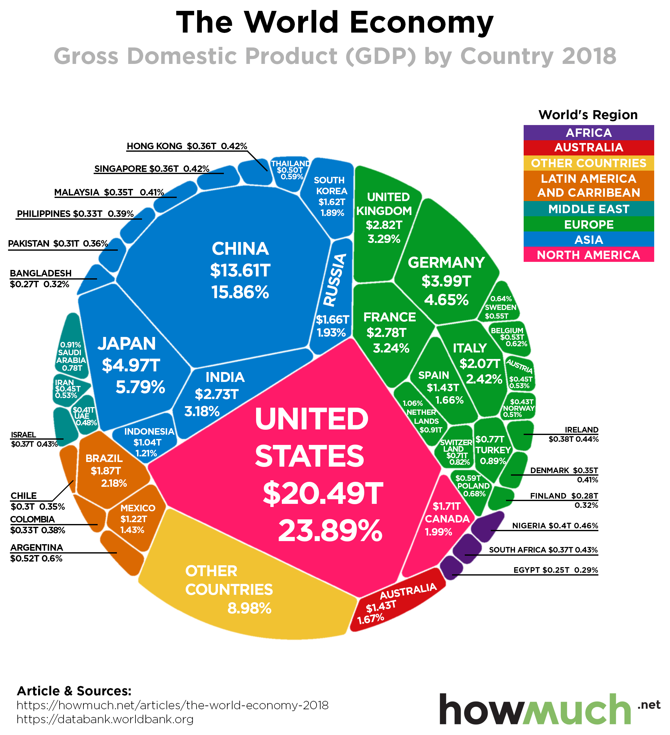 Gross domestic product (GDP) is one of the most widely accepted metrics for comparing the size of economies around the world. This single chart is perhaps the best way to understand just how big the U.S. economy is. Despite all the hype about China, the U.S. is still almost $7 trillion bigger ($13.61T vs. $20.49T).
2. Visualizing the State of Government Debt Around the World

The runner-up visual in our countdown highlights one issue creeping beneath the surface of the current global expansion: ever-increasing levels of government debt. Some countries, like Japan, have more than twice as much debt as the entire country’s GDP (238% debt-to-GDP ratio). The U.S. isn’t in much better shape (105%). This map highlights which countries are most likely to finally pop the debt bubble.
1. Mapped: How Much You Need to Retire Comfortably in Each State

Our favorite visual of the year shows how much money savers need to comfortably retire in every state. The cost of living is a major reason people move when they retire, and our map emphasizes a few unlikely states retirees should consider, like Mississippi and Tennessee, where a nest egg of less than $700K is sufficient for a decent standard of living. Retirees in Hawaii, on the other hand, need more than $1.8M.
Which one of our visualizations was your favorite in 2019? Let us know in the comments. And follow us on social media so you don’t miss anything in 2020.
Best wishes to our readers this holiday season, and a Happy New Year.
About the article
Authors
Irena - Editor