
April 3rd, 2026
The Economy
jobs
This visual breaks down the occupations with the fastest growing job markets over the next decade

April 3rd, 2026
Personal Finance
jobs
April 3rd, 2026
Personal Finance
jobs
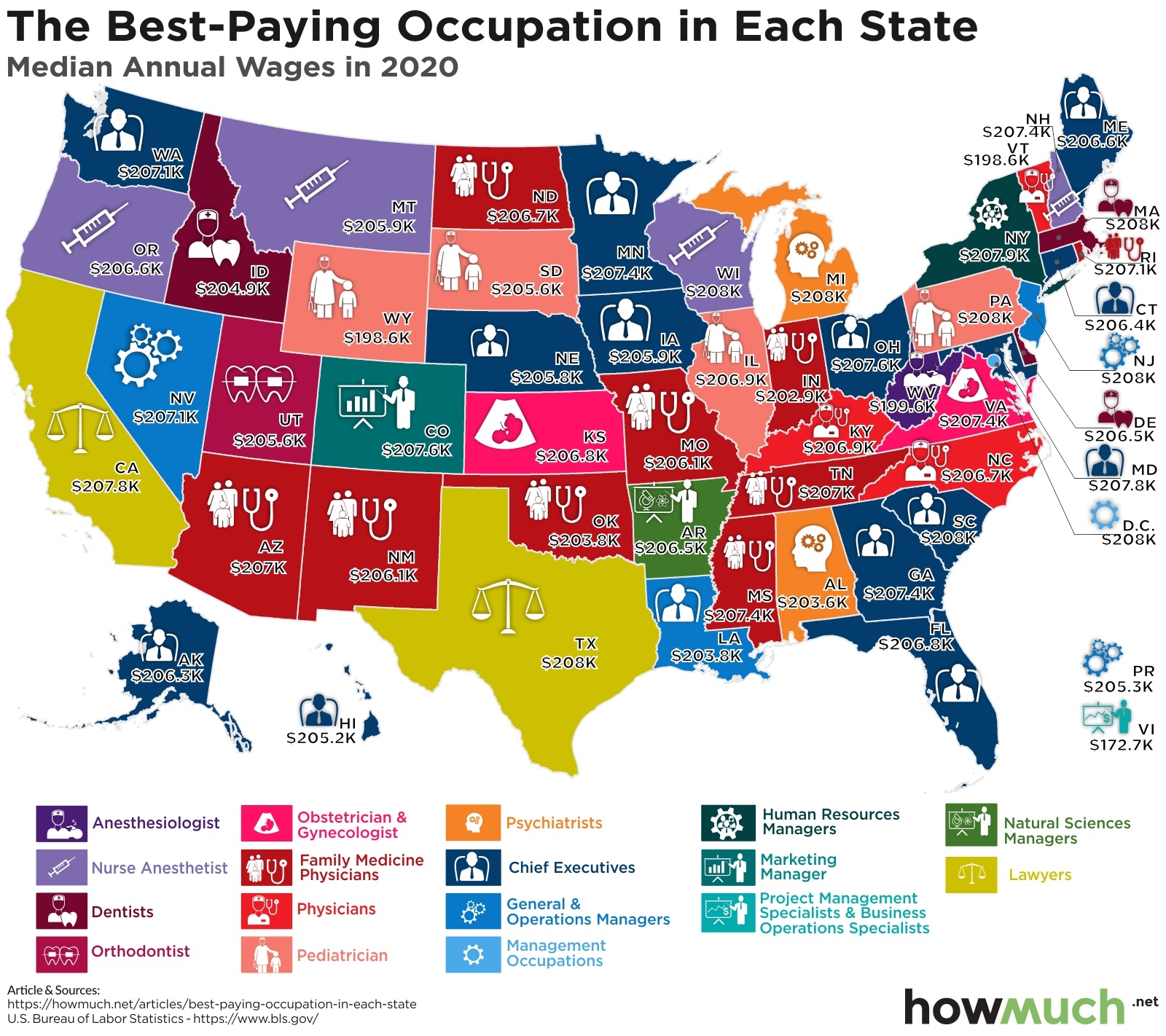
This map shows the highest paid occupation in every state in the country

April 3rd, 2026
The Economy
jobs
Our visualization illustrates the unemployment rates by metropolitan area in 2020

April 3rd, 2026
Personal Finance
business
The Economy
trade
Wealth
jobs
We pulled together our most popular visualizations of 2020 to let you know what's trending. Not surprisingly, economic issues and wealth landed at the top of our list

April 3rd, 2026
The Economy
jobs
This visualization shows employment changes by industry during the coronavirus pandemic.

April 3rd, 2026
Personal Finance
jobs
Workers’ compensation is a building block for financial security, but how much it costs depends on where you live. This visualization breaks down the most and least expensive states for workers’ compensation.

April 3rd, 2026
business
The Economy
investments
jobs
Public companies aren’t the only businesses to have an outsized effect on the U.S. economy. These private companies also command high revenues, as well as high employment.
April 3rd, 2026
The Economy
social-issues
monetary-policy
Wealth
jobs
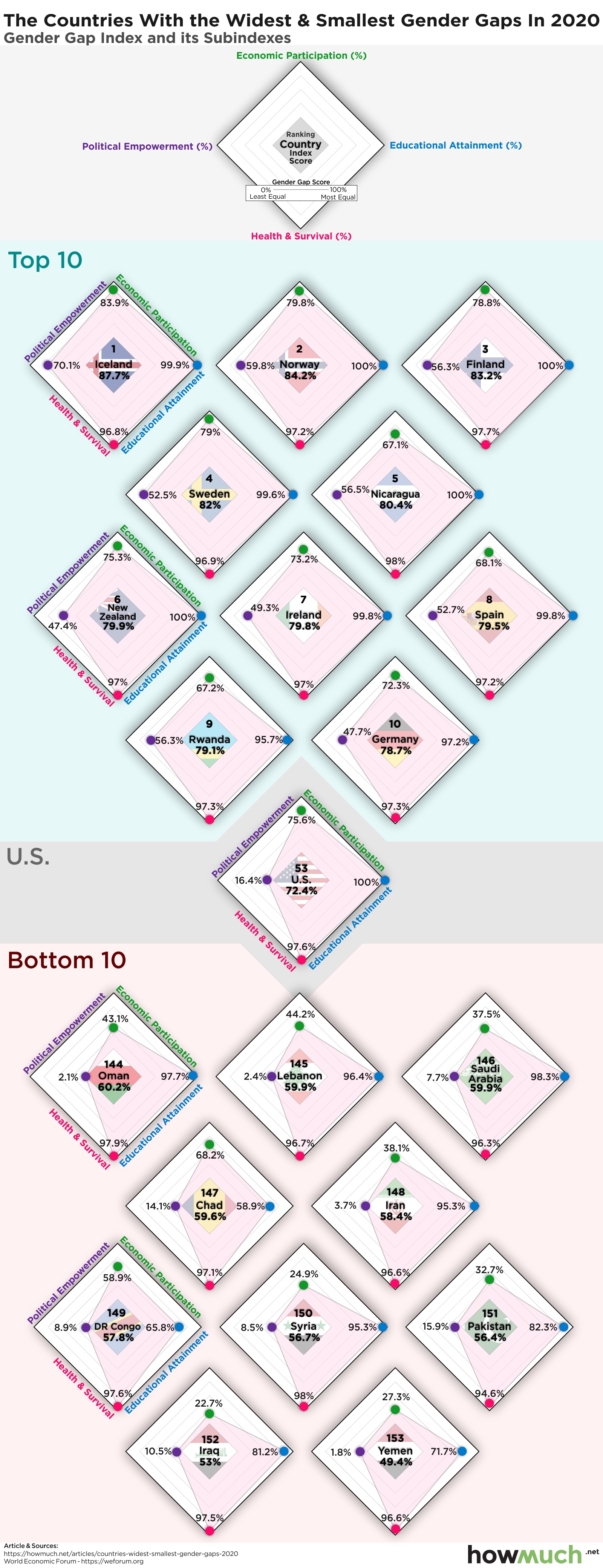
Which countries around the world lead the way in closing the gender gap and are they achieving their goals on all fronts? Our visualization lays out all the key elements for the top scorers.
April 3rd, 2026
Personal Finance
business
social-issues
Wealth
jobs
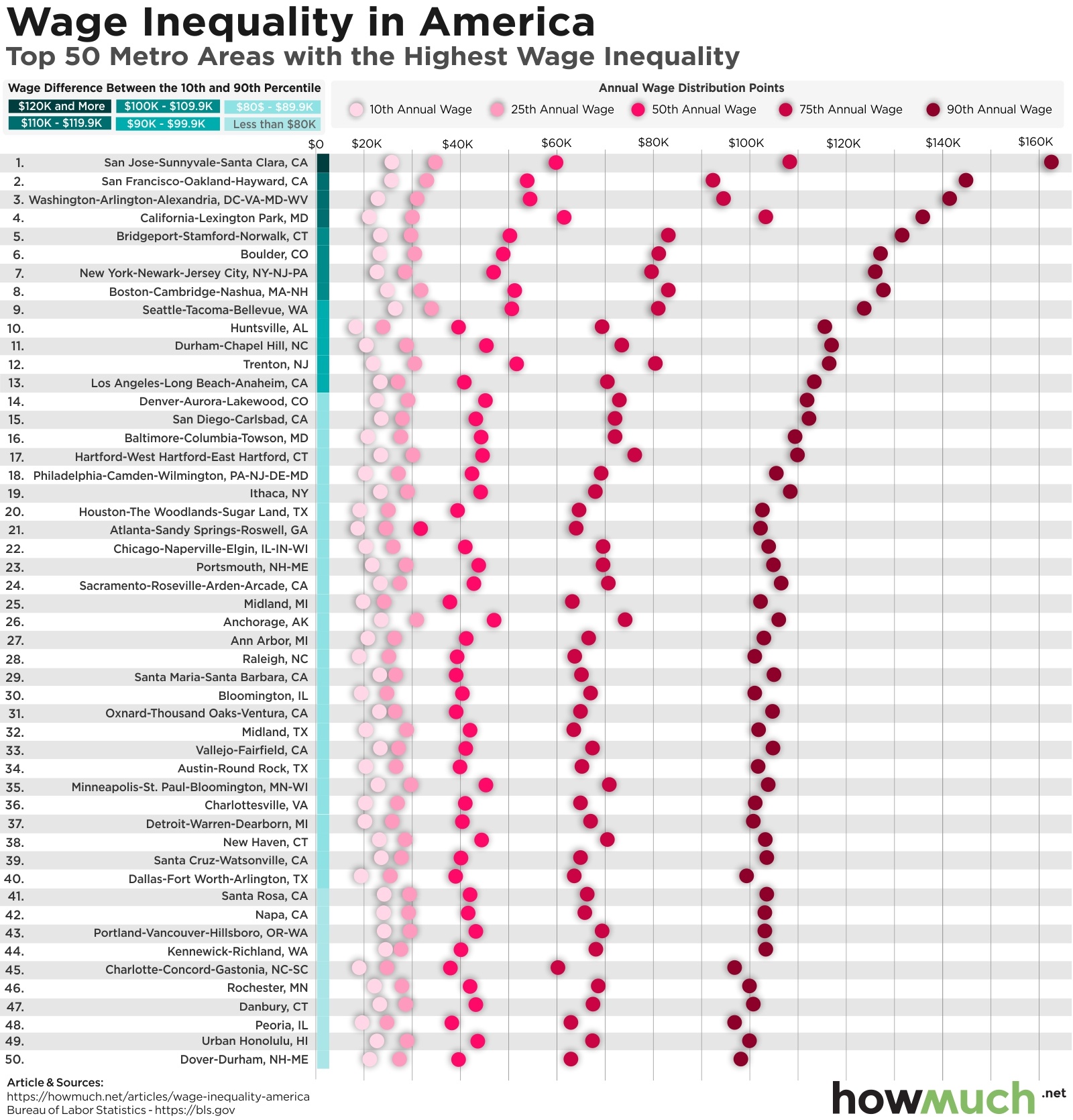
Income inequality is at an all-time high in America. This visualization breaks down the cities with the biggest gaps between high- and low-wage workers.