One of the most underappreciated problems facing the global economy right now is the ever-increasing rise of national debt, and the potential for investors to lose faith in a country’s ability to ever repay its obligations.
Gross Domestic Product (GDP) measures the total value of the goods and services produced within a country over a period of time, like a year or fiscal quarter. The ratio of debt-to-GDP makes it possible to compare relative debt levels across many different countries. The U.S. is able to carry a much larger debt in overall terms than smaller countries like Belgium because the economies are of such a vastly different size. Think about it like this. It’s no problem for Bill Gates to have a credit card bill for $50,000 because he has billions in the bank, but for the average American, that would mean bankruptcy.
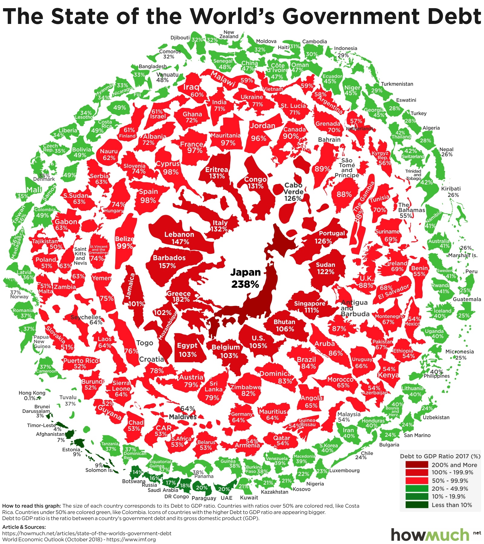
We used the latest (October 2018)complete set of numbers from the International Monetary Fund to plot debt-to-GDP ratios between countries in an interesting visualization. Countries with larger ratios appear bigger, redder, and toward the center of the visual. Our approach places the countries with the most significant debt problems at the center, letting you see which places are more likely to have substantial issues in the future.
Government Debt by Country (Debt to GDP Ratio)
1. Japan - 238%
2. Greece - 182%
3. Barbados - 157%
3. Lebanon - 147%
4. Italy - 132%
5. Eritrea - 131%
6. Republic of Congo - 131%
7. Cabo Verde - 126%
8. Portugal - 126%
9. Sudan - 122%
10. Singapore - 111%
The first and most obvious insight that our visualization reveals is how developed countries have the biggest debt problems. Japan immediately stands out as the single most prolific spender with a debt-to-GDP ratio of 238%. That means the entire Japanese economy, the third largest in the entire world, doesn’t produce nearly enough value in 2 years to pay off its entire debt. Greece is not far behind at 182%, followed by Barbados (157%) and Lebanon (147%). The U.S. has the 13th worst ratio in the world at 105%.
Immediately outside this inner ring of heavy spenders are several small or developing countries with enormous financial challenges. Egypt (103%), Cyprus (97%), Mongolia (84%), Brazil (83%) and Yemen (74%), to name only a few, clearly have debt problems that could spark financial problems for the rest of the world.
And then there are a host of green countries along the outside of our visual worth mentioning, especially China (47%), which has the second biggest economy in the world but a remarkably healthy national balance sheet. Granted, the country is still undergoing substantial urbanization and modernization, but the fact that it has such a low debt-to-GDP ratio suggests that it can spend buckets of additional money solving its challenges. Also take a look at Russia at only 16%. The Russian economy is plagued by corruption and slow growth, but at least it won’t have a debt crisis anytime soon.
Another way to think about this visual is in terms of spending and revenue, which is to say, should countries with high debt-to-GDP ratios spend less money or collect more tax revenue? We doubt any country can actually “grow” its way out of a crushing debt burden worth more than its entire GDP without making substantial changes to its fiscal behavior. Policymakers will eventually have to solve this problem, and either option poses serious challenges to economic growth.
Correction Jan. 4th: Our map was updated to show all countries with the latest available data provided by International Monetary Fund.
Data: Table 1.1
About the article
Authors
Irena - Editor