
April 3rd, 2026
The Economy
social-issues
Our visualization looks at a timeline of the costliest riots and civil unrest in the United States in the last 100 years

April 3rd, 2026
business
The Economy
social-issues
Our top 5 favorite visualizations from the last month beautifully illustrate key insights into the coronavirus pandemic, data breaches and the world’s population
April 3rd, 2026
Personal Finance
The Economy
social-issues
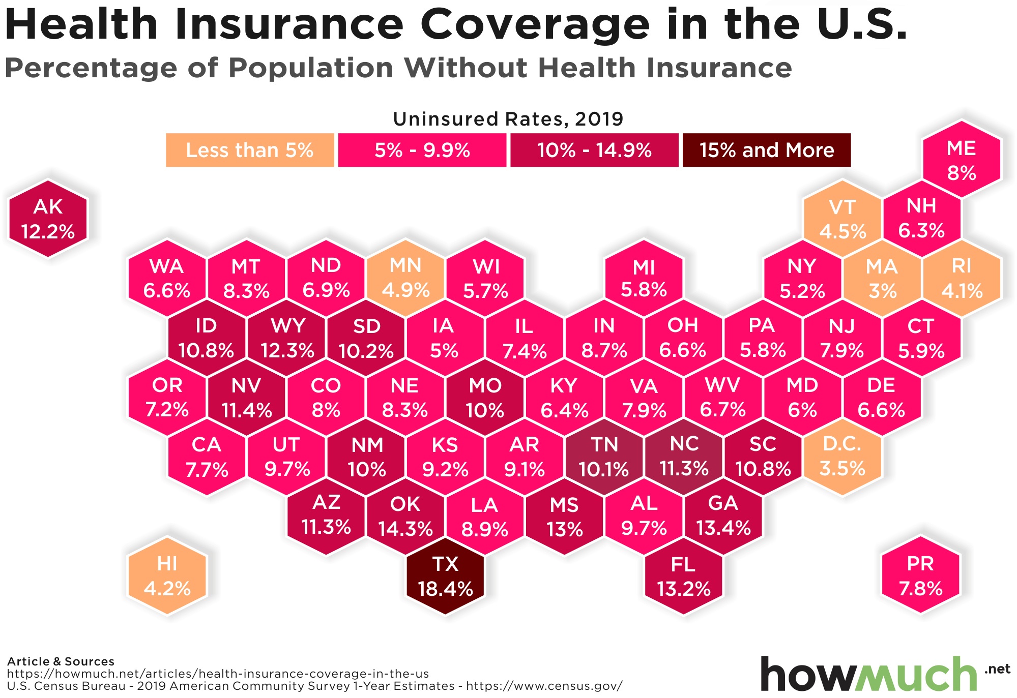
There are a lot of Americans who don’t have health insurance. Here’s the rate of uninsured Americans in every state

April 3rd, 2026
Personal Finance
social-issues
The gender wage gap refers to how men make more money than women. This visualization shows which industries have the biggest problem paying women less than men

April 3rd, 2026
The Economy
social-issues
Wealth
Our visualization displays both the number of people and the percentage of the population living in extreme poverty for countries around the world

April 3rd, 2026
Personal Finance
social-issues
Wealth
These visualizations illustrate the economic inequality between the black and white community in the U.S., updating our work from last year

April 3rd, 2026
business
The Economy
social-issues
The coronavirus is hitting profit margins at lots of businesses. Here is how some of the most recognizable corporations are performing in the corona-economy.

April 3rd, 2026
The Economy
social-issues
The Paycheck Protection Program (PPP) is benefiting some states a lot more than others. These two maps tell the real story of who is winning the most coronavirus stimulus

April 3rd, 2026
Personal Finance
The Economy
social-issues
Our new visualization shows how the current unemployment rate stacks up against unemployment rates in the past century.

April 3rd, 2026
Personal Finance
social-issues
Wealth
These three visualizations highlight an enormous racial income gap between white and African American workers across the country.