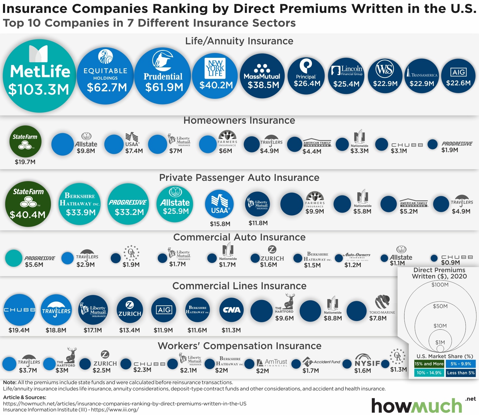
There’s a lot of fantastic data visualization professionals out there, and we’d like to highlight some of our personal favorites we saw over the last month. Our top 5 favorite visualizations all have one thing in common. They do a good job of helping us understand our place in the world and the historical context of a global pandemic and its impacts on industries.
The World’s Deadliest Pandemics

Visual Capitalist’s Carmen Ang powerfully situates the coronavirus pandemic in its proper historical context by comparing it to the deadliest pandemics of all time. This is not to minimize the severity of Covid-19, but instead highlight the significant advances of science and medicine over the centuries. If approximately half the world’s population perished in the Black Death, before doctors understood modern germ theory, then we are all lucky to live in an era where vaccines are rolling out in record time.
Start-up Funding by Industry: 2019 vs. 2020 (Animation)

Business Financing has an original way to visualize how start-up funding changed from 2019 to 2020. Despite the coronavirus pandemic, start-ups received an incredible 42% more funding than they did the prior year. The creatives at Business Financing demonstrate how these funds are unevenly distributed around the world, and the U.S. only increased its share of start-up funding in the pandemic.
See the animation HERE.
Lockdowns Help Ease Covid-19 Death Toll From January Peak

It’s hard to wrap your head around how disproportionate the coronavirus’ impact has been around the world for the past year. The Finance Times has a brilliant visual demonstrating how far the world has come, and indeed how far the pandemic is ending. Deaths are on the decline in the U.S., but they’ve never been higher in Brazil. In fact, taking a step back to look at deaths across the whole world, we aren’t that far removed from the peak in late January 2021.
World’s Biggest Data Breaches and Hacks (Interactive Visualization)

One thing the coronavirus pandemic has changed is how much people rely on the Internet. And because so many companies now collect and use consumer data, there is a large and growing threat from hackers. The researchers at Information is Beautiful do a great job demonstrating how common large data breaches have become. Indeed, scrolling up and down this visual shows how the number of companies and the size of the hacks only increases with each passing year.
See the visualization HERE.
Map: A Look at World Population Density in 3D

We originally discovered Alasdair Rae’s eye-catching visualization of the world’s population density on Twitter. This is a beautiful take on the distribution of the world’s population because of its minimalist aesthetic. The viewer’s attention is drawn to the yellow peaks representing humanity’s greatest concentrations across the Eastern Hemisphere. This is a great reminder that the vast majority of people live somewhere along a coastline and not in the interior of continents.
How do you like our selection of visualizations from around the Internet? Have you seen any creative and unique data visualizations in the last month? Drop us a link in the comments.
About the article
Authors
Irena - Editor


