President Trump talks about the U.S. trade deficit all the time. He recently proposed new tariffs on steel and aluminum as one way to help lower the trade deficit that has contributed to shrinking American growth in these industries. With so much attention being paid to one economic number, now is a good time to understand how the trade deficit has changed over the decades.
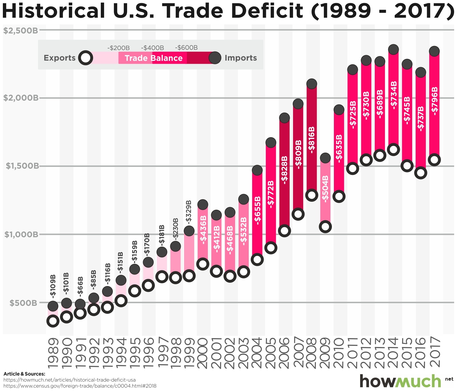 The data for our graph is based on figures from the U.S. Census Bureau. We visualized the deficit by plotting the total value of exports out of the U.S. as an open circle. Then, we placed the value of imports into the U.S. directly above it as a solid circle. The space between the two circles represents the trade deficit for each year, which we color-coded from light to dark red to show the severity of the deficit. All figures are calculated on a nominal basis, meaning that they aren’t adjusted for inflation. Visualizing imports, exports, and the deficit over the last 30 years reveals several key insights about the American economy.
First off, our trade deficit numbers only account for the difference between the value of physical goods being imported into and exported out of the United States. That means we’re counting things like cars, electronics, and food. Should we also include the value of services, like tourism, health care, or insurance? We’ll leave that for President Trump and the pundits to decide, but for simplicity’s sake we’re only focusing on physical imports and exports.
One thing is immediately clear: imports and exports are both on an upward trajectory year over year, but imports tend to grow faster. In other words, when looking at the graph you will notice the gap between the two numbers has gotten larger and larger while the space between the two circles has also become darker and darker. In short, the trade deficit used to be relatively small, averaging less than $150B year over year in the 1990s, but then it exploded in the 2000s. The single biggest increase occurred in 2004 when it jumped from $532B to $655B—a whopping $122B in one year.
There are a few obvious caveats to this pattern. The trade deficit reached its highest point in 2008 at $816B before collapsing in the wake of the Great Recession to $504B. This proves that closing the trade deficit isn’t necessarily an indication of a healthy economy. The gap then continued to grow again with the recovery, despite a speed bump in 2013 when it shrank to $689B from $730B the year prior. As a matter of fact, the trade deficit shrank the last year of Obama’s presidency before growing again under Trump.
Economists care about the trade deficit because it helps answer several important questions about the economy. For one thing, to what extent does a country rely on manufacturing, as opposed to consumption, for growth? Note that, interestingly, countries that export a lot more than they import don’t automatically have the best economies. For example, Thailand (+$44B), Russia (+$41.5B), and Nigeria (+$7.7B) all have trade surpluses, but there’s no chance any of them will overtake the U.S. in per capita income anytime soon. The $800B trade deficit is a problem, but clearly the macroeconomic health of the country is more complicated than a single number might lead you to believe.
Data: Table 1.1
About the article
Authors
Irena - Editor