April 3rd, 2026
The Economy
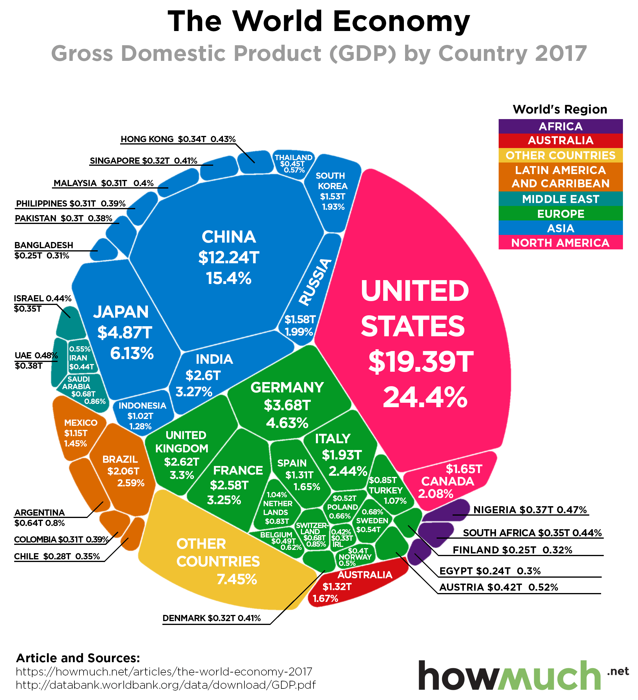
President Trump is signing trade deals and threatening more tariffs, vowing to shake up the global economic order. Our new visualization puts the world’s economies in stark contrast: it’s the U.S. and everybody else.

April 3rd, 2026
The Economy
social-issues
Income inequality is once again a hot button political issue, but how pervasive is the problem? Our new map highlights the metro areas with the highest and lowest income ratios between the top 1% of earners and everyone else.

April 3rd, 2026
The Economy
trade
Tourism is a big part of the global economy, but the industry’s size varies dramatically between countries and across continents. Our newest map provides a snapshot of how much money each countries generates from international tourism.

April 3rd, 2026
The Economy
cryptocurrencies
Bitcoin is in a slump, but if you take the long view, its value is still significantly higher than a year ago. In fact, the entire cryptocurrency market is now worth billions more than Jeff Bezos and Bill Gates

April 3rd, 2026
The Economy
social-issues
Natural disasters are always in the news, but do you know which ones end up causing the most damage? Our newest visualization explores the cumulative damage of natural disasters across the U.S. since 1980.
April 3rd, 2026
The Economy
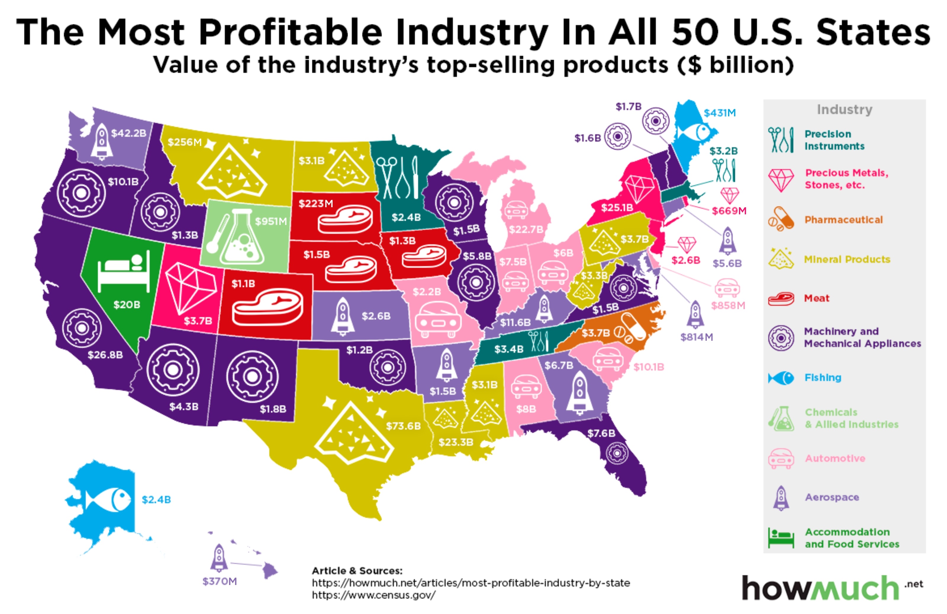
Texas has oil drillers, Alaska has fishermen, and Kansas has… astronauts? Our newest map breaks down the most profitable industries for every state across the country. The results might surprise you.

April 3rd, 2026
The Economy
Spending on research and development is essential for building long term economic strength, but countries invest in R&D at radically different rates. Our latest visualization ranks which countries are on top in this critical field.

April 3rd, 2026
The Economy
Everybody knows that college graduates add the most value to the economy, so why aren’t states investing in higher education at the same rates? Our new map breaks down per student funding rates for every state in the country.

April 3rd, 2026
The Economy
trade
President Trump is focused on reducing the U.S. trade deficit by imposing new tariffs on specific products and goods from other countries. Our new map reveals the entire import market in one intuitive visualization.

April 3rd, 2026
The Economy
trade
Trump is preparing to impose tariffs on China any day now, but the U.S. could potentially have a lot to lose. Our new map demonstrates the size of the export market for every country around the world.