April 3rd, 2026
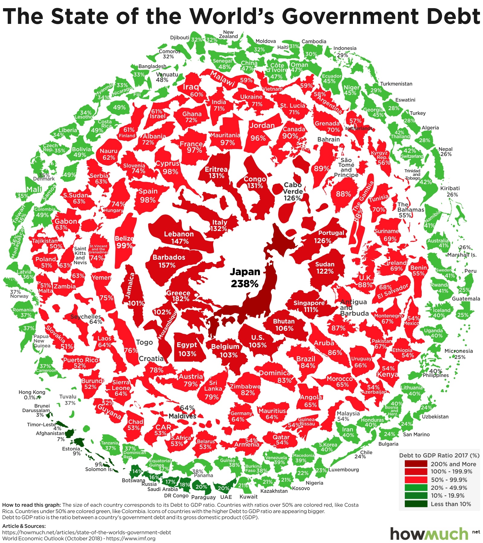
The Economy
debt
Policymakers have avoided dealing with debt for years, guaranteeing that any resolution will be more painful. This visualization shows which countries have the biggest problems with national debt relative to their economic size.

April 3rd, 2026
The Economy
Another year is in the books, and we’re thrilled to present our list of the top 18 visualizations from 2018. Understanding money should be easy, and we aim to make it aesthetically pleasing too. We are humbled by the continued growth of our audience. A big thank you to our readers for a great year, and we wish you all the best in 2019!

April 3rd, 2026
The Economy
Is wind power the solution to climate change? It turns out that lots of deep red states like Texas and Oklahoma lead the country in terms of wind power generation. Our visualization breaks down a state-by-state ranking.

April 3rd, 2026
The Economy
debt
The U.S. economy is built to run on consumption, and consumption is fueled by debt. Our visualization categorizes household debt, making us wonder how much longer it will take until something bursts
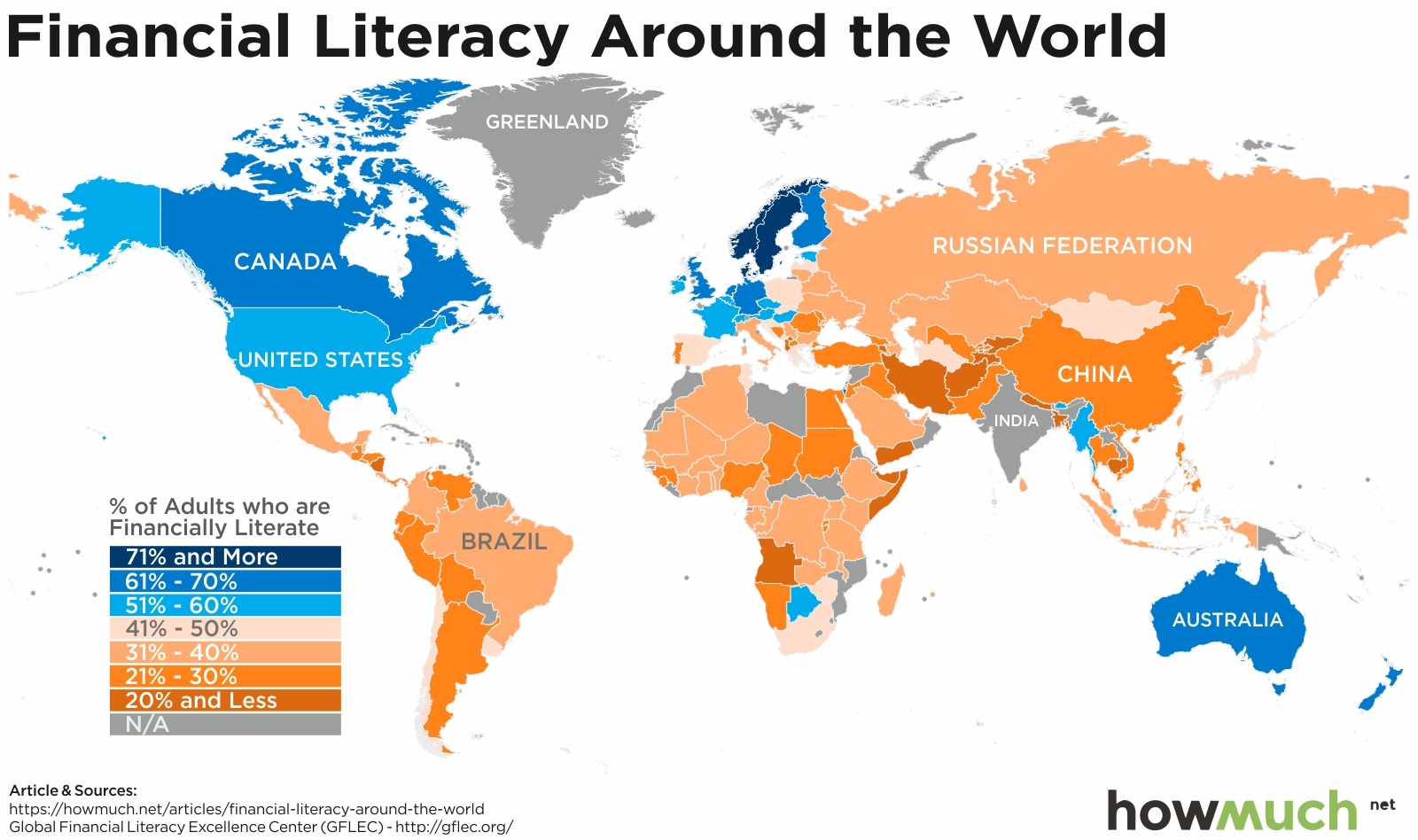
April 3rd, 2026
Personal Finance
The Economy
Being financially literate means you understand basic concepts like diversification, inflation and compound interest. Our series of maps indicate relatively few people around the world do.

April 3rd, 2026
The Economy
social-issues
Our visualization explores relationship between public perceptions of fairness and the size of every country’s economy

April 3rd, 2026
Personal Finance
The Economy
Is the American Dream over? Our visualization breaks down the obscene levels of income inequality between the disappearing middle class and everyone else
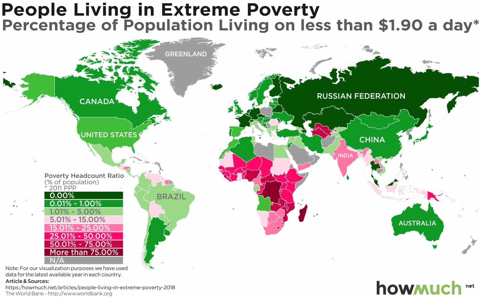
April 3rd, 2026
The Economy
social-issues
Extreme poverty is on the decline, but there are still lots of countries with crushing rates of subsistence living. Our new series of maps highlights where the have’s and have-not’s live around the world.

April 3rd, 2026
The Economy
debt
The U.S. national debt is now well over $21 trillion, but how did we get here? Our visualization explores which U.S. Presidents have added the most to the national debt since the country’s first budget in 1789.

April 3rd, 2026
The Economy
trade
Think your car is all American? Think again. It may have come from one of these countries. A global trade war is in full swing. This visualization on U.S. auto imports may give you some perspective.