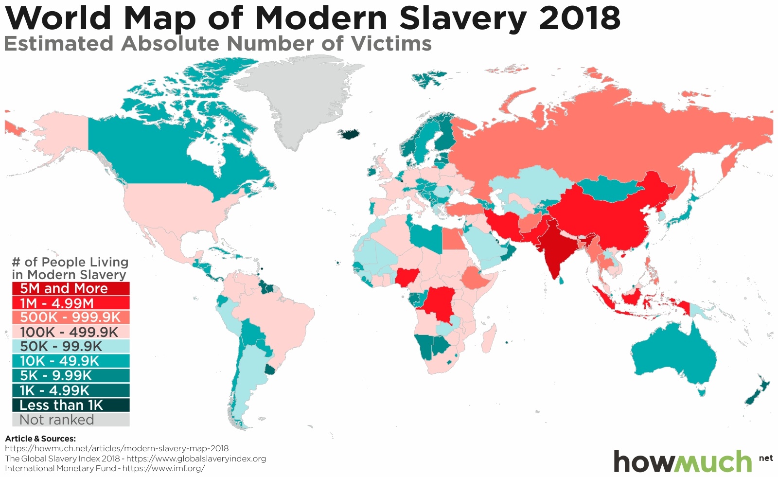
Tens of millions of people are in slavery around the world, and lots of them live in your country. That’s according to the 2018 Global Slavery Index, a detailed analysis of modern human trafficking and slavery around the world from the Walk Free Foundation.

The best way to start to understand the global landscape of slavery is by looking at absolute numbers, paying no attention to population size. A glance at our worldwide map reveals the staggering scale of the problem. There are well over 40M people in slavery around the world. Our color-coded approach lets you easily see how the vast majority of human slavery, measured in overall terms, occurs in places like Southeast Asia, India, China, Russia and a few countries in Africa, like Mauritania and South Sudan.
We’re quick to point out that hundreds of thousands of people are trapped in slavery throughout the West. In fact, several Eastern European countries have lower overall numbers than Spain, France, England and Germany. A number of countries in Africa and South America have a better track record than the U.S.
It’s worth pausing to clarify the methodology used to gather these numbers. First of all, slavery can be difficult to define, and researchers used a few different concepts, including forced marriage, bondage, indentured servitude and human trafficking. If people are being treated like property, it’s slavery.
How did researchers arrive at total numbers encompassing all these activities for so many countries? They administered a survey to 71,000 respondents across 48 countries. They then extrapolated results for other countries with similar risk profiles. These are some of the best and most widely reported numbers available even if some governments and scholars disagree with the findings. You can read more about the study’s methodology here.

Absolute numbers only give a sense for how many people are involved in slavery overall, but some countries are significantly more populated than others. We therefore applied the same color-coded methodology to see how many people out of 1,000 are in slavery, shifting the lens to places where a great proportion of people live in slavery.
The Walk Free Foundation finds that North Korea is the global capital of human slavery, affecting an estimated 105 out of every 1,000 people. Eritrea has the second highest rate at 93. The extent of human tragedy in these places is truly astonishing.
Focusing on per capita enslavement also reveals how Central Africa and the Middle East have proportionally more significant problems than surrounding regions. China falls off the list of worst offenders, and no country in Western Europe has a rate higher than 5 out of 1,000 people. Venezuela and Haiti are the only countries in the entire Western Hemisphere shaded dark red.

And finally, we put together a deeper analysis of global slavery as it relates to gross domestic product (GDP) per capita. We adjusted the size of each country according to the overall number of people in slavery, and we color-coded each one according to its GDP per capita. The combination of both datasets reveals how rich economies see lower rates of enslavement. Take Asia and Africa, for example, where only a few countries are shaded blue. The large countries shaded orange indicate a high overall number of enslaved individuals combined with very low GDP per capita. Compare that with the maps for Europe and North America, where there are relatively small countries colored blue. That indicates these countries have low overall slavery numbers, but high GDP per capita.
We’re clearly onto something even if the correlation between GDP per capita and enslavement isn’t perfect. It’s not like countries just need to grow their economies and slavery will simply vanish. In fact, the U.S. has more people in slavery than Mexico (403K vs. 341K). Germany has a higher number than Belarus (167K vs. 103K). This suggests that countries must tackle the issue head on in addition to pursuing economic development.
Data: Table 1.1
About the article
Authors
Irena - Editor


