April 3rd, 2026
The Economy
social-issues
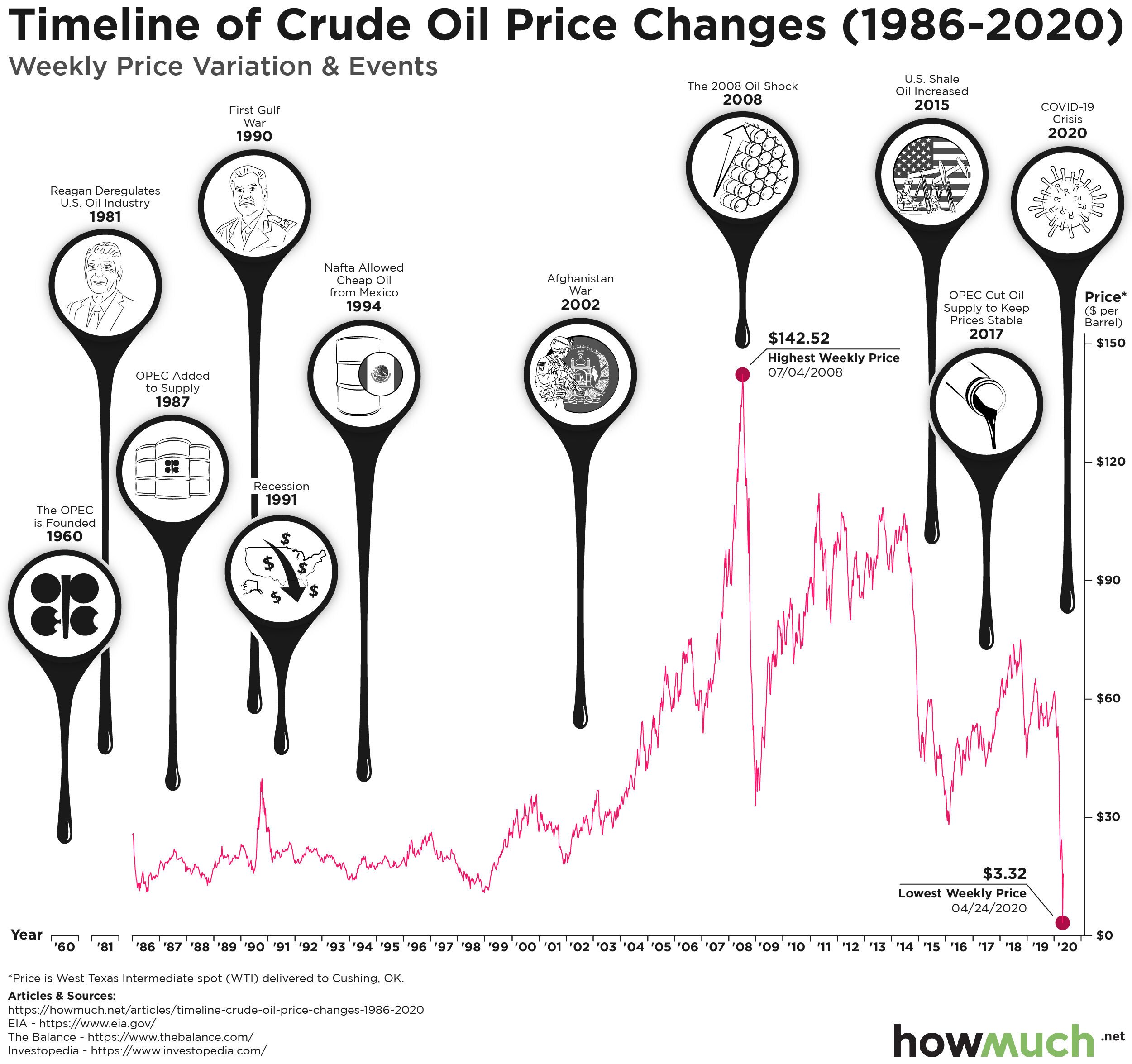
Tracing the unprecedented drop in oil prices and its implications

April 3rd, 2026
Personal Finance
business
The Economy
social-issues
Homeowners insurance can be an expensive but necessary item in your budget. This map breaks down how much it costs in every state around the country.

April 3rd, 2026
business
The Economy
social-issues
What’s in store for the world’s largest manufacturing producers?

April 3rd, 2026
Personal Finance
The Economy
social-issues
monetary-policy
What stimulus plans have been implemented for the world’s largest economies due to the coronavirus?

April 3rd, 2026
Personal Finance
The Economy
social-issues
monetary-policy
Wealth
The coronavirus crisis has thrust issues of economic inequality into the spotlight. But what did economic inequality, as measured by the distribution of wages, look like before the outbreak?

April 3rd, 2026
Personal Finance
The Economy
social-issues
monetary-policy
The U.S. government is spending $2 trillion to stimulate the economy and fight the coronavirus. Here’s where the money is going.

April 3rd, 2026
The Economy
social-issues
debt
This visualization charts the major events associated with an ever-climbing level of national debt.

April 3rd, 2026
The Economy
taxes
social-issues
monetary-policy
With $150b approved, Congress hopes to blunt the impact to state and local governments through a direct infusion of cash. Our visualization highlights the approach taken by lawmakers to divvy up the funds.

April 3rd, 2026
Personal Finance
The Economy
social-issues
What does a two-week quarantine food supply cost in the U.S.?

April 3rd, 2026
social-issues
Want to take action right now against the coronavirus? Donate to the World Health Organization’s COVID-19 Response Fund.