
April 3rd, 2026
Personal Finance
The Economy
Is the American Dream over? Our visualization breaks down the obscene levels of income inequality between the disappearing middle class and everyone else
April 3rd, 2026
Personal Finance
taxes
The media is hyper-focused on federal tax policy, but is that the right approach? We take a deep dive into state taxes on income, sales, gasoline and death to understand how your tax burden depends on where you live.
April 3rd, 2026
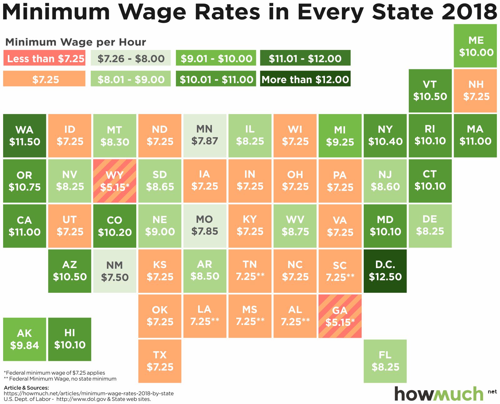
Personal Finance
jobs
One of the most hotly contested political debates in the United States is the minimum wage. Pro-business advocates say a high minimum wage hurts business, while pro-labor advocates say the minimum wage should be raised to help the working poor. Have a look at our chart below to see your state’s minimum wage.

April 3rd, 2026
Personal Finance
debt
Student debt is a drag on the U.S. economy. Our new visualization explores the extent of the problem across the country, revealing that student debt levels have everything to do with where people go to school.

April 3rd, 2026
Personal Finance
social-issues
Regardless of which state you live in, the top 1% of wage earners bring home substantially more money than the bottom 99%. Our new work explores the geography of income inequality across the US.

April 3rd, 2026
Personal Finance
Real Estate
The housing market has recovered, and median worker pay just reached an all-time high. Our new map highlights how much money you need to make in the 50 largest American cities to afford a typical house

April 3rd, 2026
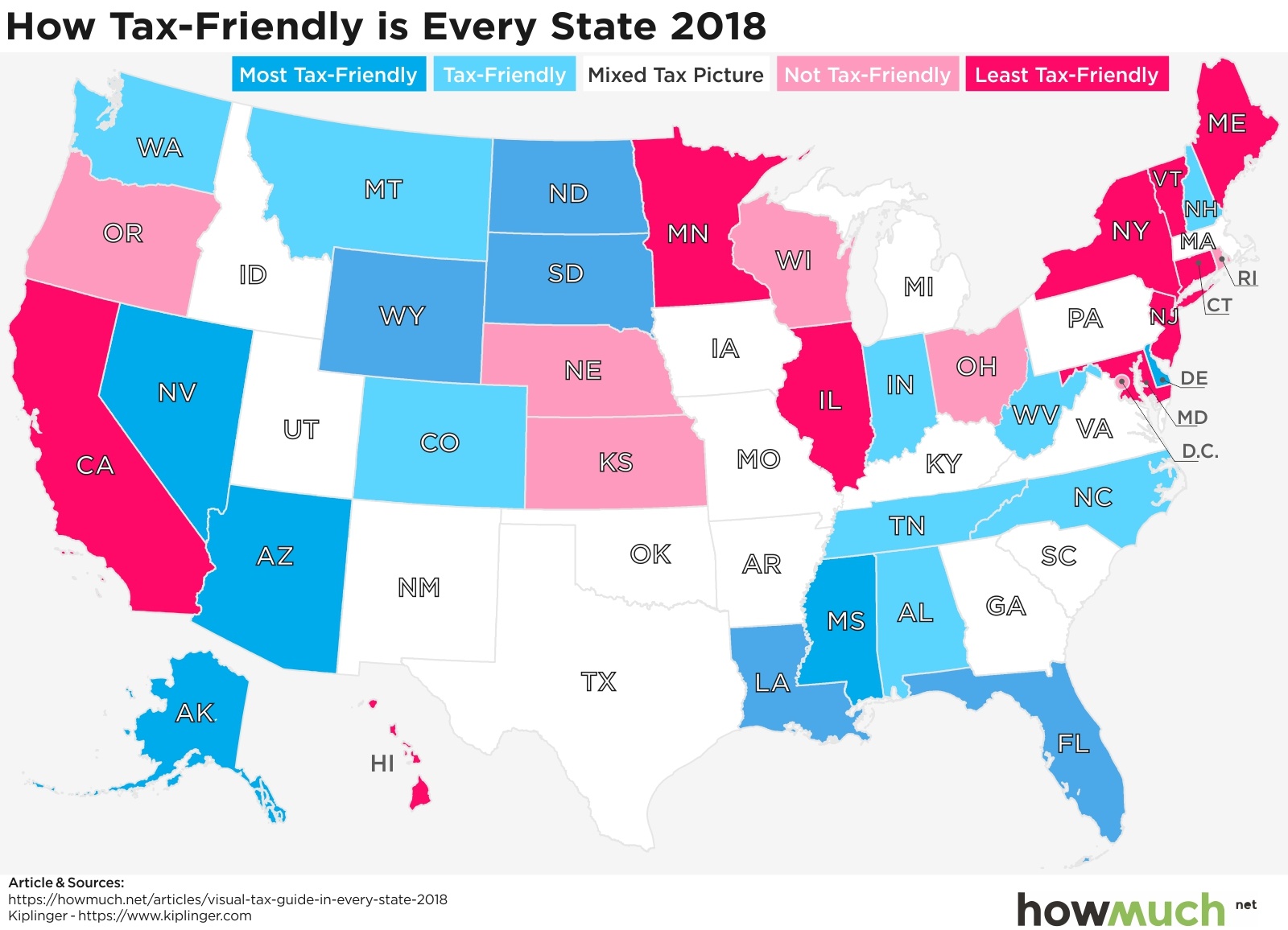
Personal Finance
taxes
Trump’s tax cut is in full force and Republicans are trying to make it permanent, but is it affecting everyone equally? An often-overlooked aspect of taxation is geography—where you live determines a lot about your total tax burden.

April 3rd, 2026
Personal Finance
There is a giant hole in the safety net.Our visualization highlights the enormous difference between what social security pays out and the average living expenses in every state.

April 3rd, 2026
Personal Finance
The richest 1% are insanely rich, but did you know that there’s inequality even among the wealthiest people? This visualization reveals how much income is needed to crack the top 1% and the average income in that elite group

April 3rd, 2026
Personal Finance
social-issues
Should people get paid more just because they have more experience? Our new map breaks down median income levels among different generations for each state, and Millennials are far behind their older colleagues.