The United States hasn’t seen GDP growth over 4% since the year 2000, but President Trump recently said he thinks 6% GDP growth is within reach. What would that look like for the American economy and what could people expect in terms of employment and wage growth? Take a look at our new visualization.
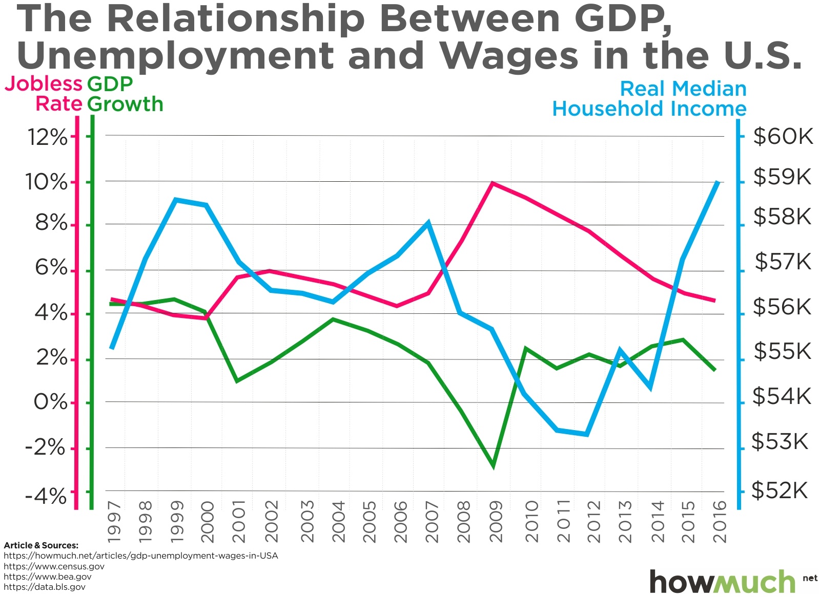 We retrieved the data relating to GDP, unemployment, and median income from the online financial magazine The Balance, which compiled its figures from the respective offices of the U.S. government (see the viz for sources). To generate our viz we first adjusted median income totals to account for inflation, also called real income, so that we could make true comparisons between different years. We then plotted figures for every year since 1997 on the same graph, revealing a quick snapshot of 20 years’ of economic history.
GDP is an old school measure of the economy that originated during the industrial era. Many people think it doesn’t matter anymore because it fails to capture the changes in the quality of products in use at any given time. For example, GDP counts the physical costs of telegrams against the physical costs of email without considering the less tangible benefits of using the latter. GDP also ignores entire industries geared toward creating high-quality experiences (as opposed to physical products). That being said, it is still a shorthand way of measuring the health and trajectory of an economy, and it says a lot about both unemployment and wage growth. Developed countries like the United States typically have slower GDP growth than developing ones, like India or China.
Looking at the real median income figures tells an interesting story. The numbers have actually declined in 11 of the past 20 years, meaning that workers in general have smaller paychecks. As our graph demonstrates, wages are inversely correlated with employment. In other words, as employers shrink the number of individuals they employ the supply-and-demand effect allows them to pay their people less. Alternatively, when employment ticks up and labor becomes scarce, wages shoot back up. If the past is any indication, recent headlines suggest that American workers are due for another pay raise. In fact, in our graph 2016 was the best year for median incomes, rising 3.2% over the previous year to $59,039.
Things have generally been going well for American workers with GDP growth of 2-3% every year. Doubling that output to 5%, or even 6% as President Trump would like to see, would mean colossal and sustained gains in real wages for workers. We aren’t talking one-time bonuses thanks to a tax cut, but thousands and thousands of dollars in extra base pay. As long as inflation stays under control, additional increases in GDP would only benefit American workers even more.
Data: Table 1.1
About the article
Authors
Irena - Editor