April 3rd, 2026
The Economy
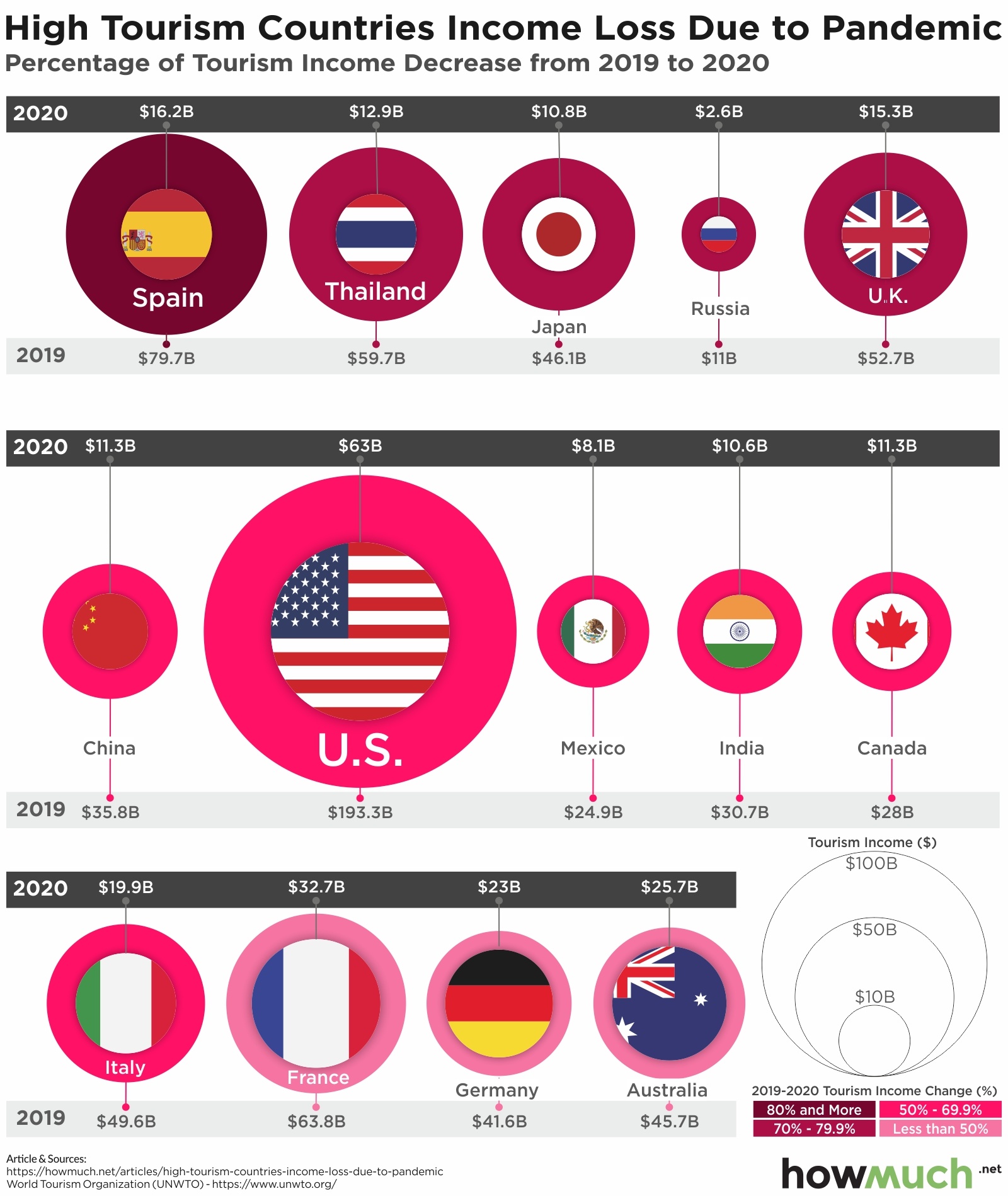
Here’s how to visualize the economic damage from COVID-19 on the global tourism industry

April 3rd, 2026
The Economy
This article and visualization illustrate total COVID-19 spending, categorized by agency, and provide agency spending figures (as of February 28, 2021) based on the total U.S. federal budgetary resources for FY 2021

April 3rd, 2026
The Economy
Here’s how Joe Biden’s American Jobs Plan is spending $2.65T of taxpayer money

April 3rd, 2026
The Economy
This visual uses Regional Price Parities (RPPs) to show which states are the most expensive (and cheapest) for buying everyday goods and services

April 3rd, 2026
The Economy
social-issues
Our visualization looks at a timeline of the costliest riots and civil unrest in the United States in the last 100 years

April 3rd, 2026
The Economy
This chart will help you understand which COVID-19 vaccine stocks performed the best (and worst) over the last year
April 3rd, 2026
The Economy
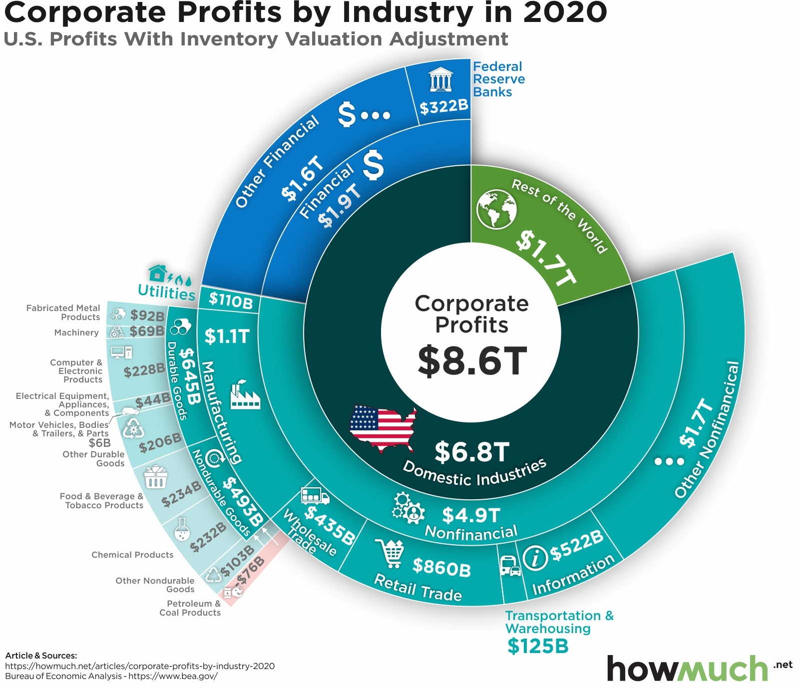
U.S. corporate profits are extremely high. This visual shows which sectors and industries generate the most money

April 3rd, 2026
business
The Economy
social-issues
Our top 5 favorite visualizations from the last month beautifully illustrate key insights into the coronavirus pandemic, data breaches and the world’s population
April 3rd, 2026
Personal Finance
The Economy
social-issues
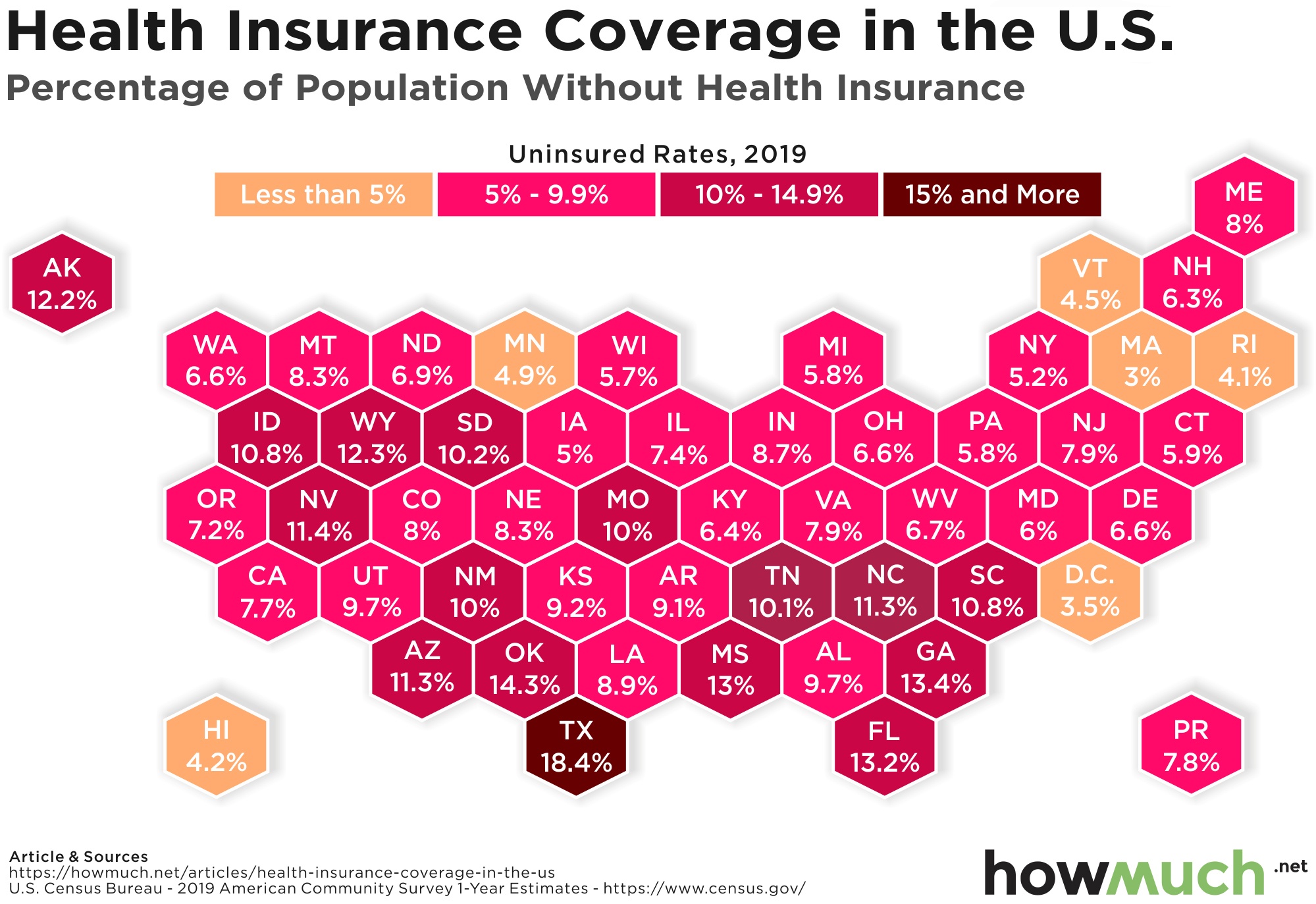
There are a lot of Americans who don’t have health insurance. Here’s the rate of uninsured Americans in every state

April 3rd, 2026
The Economy
taxes
This visualization breaks down total tax revenue statistics by each country in the OECD