
April 3rd, 2026
The Economy
investments
The coronavirus is causing a lot of investors to consider precious metals like silver and gold. This visualization provides a snapshot of the financial history for these precious metals.

April 3rd, 2026
Personal Finance
social-issues
Wealth
These three visualizations highlight an enormous racial income gap between white and African American workers across the country.
April 3rd, 2026
Best Personal Loans for Fair Credit

April 3rd, 2026
Personal Finance
jobs
Workers’ compensation is a building block for financial security, but how much it costs depends on where you live. This visualization breaks down the most and least expensive states for workers’ compensation.

April 3rd, 2026
The Economy
debt
The U.S. debt continues to skyrocket thanks to the coronavirus pandemic. This visualization breaks down the biggest foreign holders of U.S. government debt

April 3rd, 2026
The Economy
trade
Whether you prefer a pinot or a chardonnay, find out which countries are responsible for the most wine exports.
April 3rd, 2026
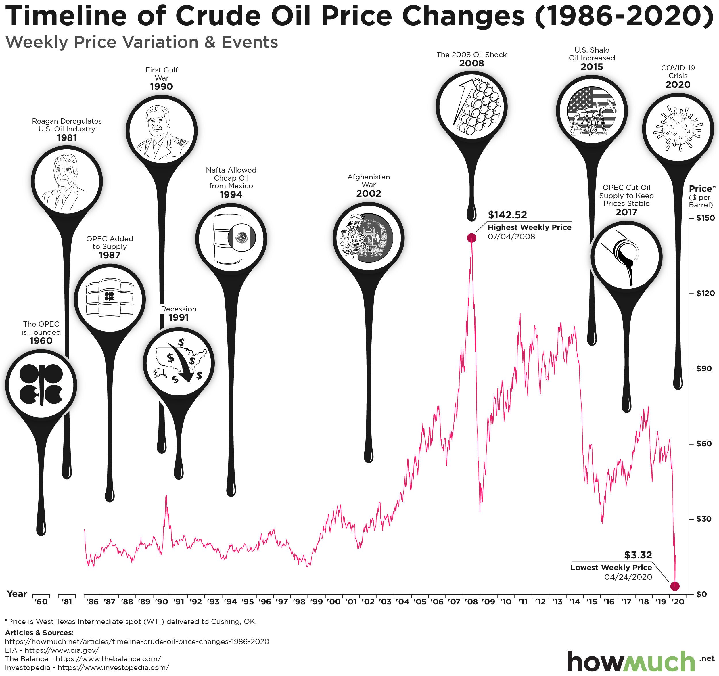
The Economy
social-issues
Tracing the unprecedented drop in oil prices and its implications

April 3rd, 2026
Personal Finance
The cost of auto insurance varies depending on where you live. Check this visualization to see the average rates for both full and minimal coverage for every state in the country.

April 3rd, 2026
The Economy
The U.S. pays more than $100M each year to support the WHO. Check this visual to see if other countries are paying their fair share.

April 3rd, 2026
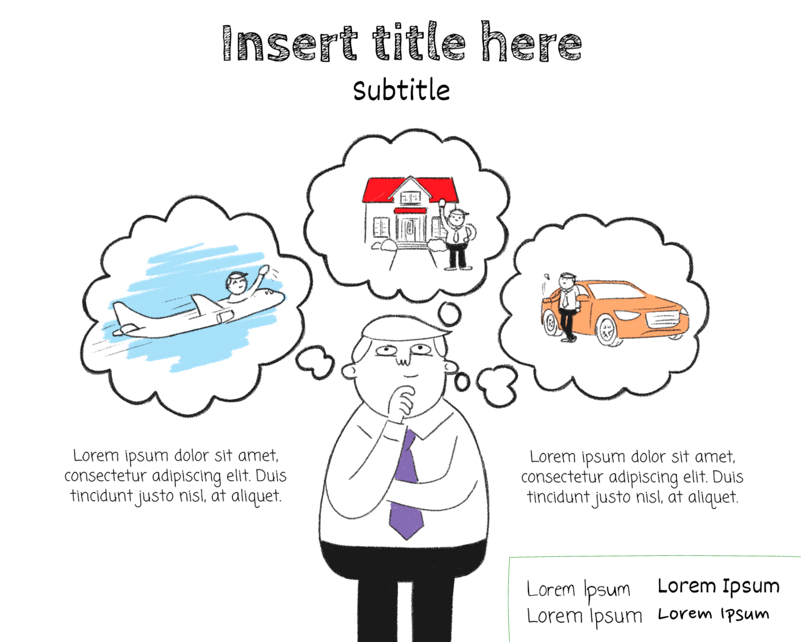
Personal Finance
business
The Economy
Wealth
You might already know that Jeff Bezos and Bill Gates are the richest men in the world. So who are the wealthiest women?