World Poverty Map - How Many People Live in Extreme Poverty by Country
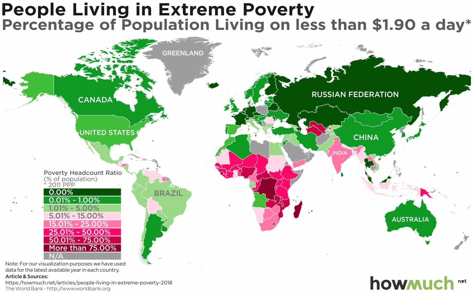
A new report from the World Bank just landed, finding that a record low of 10% of humanity now live in extreme poverty, down from 11% in 2013. But poverty rates aren’t anywhere close to equal between continents or even countries, as our new series of maps clearly demonstrates.
 The World Bank provides an in-depth explanation for its methodology, which you can find in Appendix A of the full report here. We focused on the percentage of people in each country living below what the World Bank defines as extreme poverty, or $1.90/day. We’ll let the researchers defend this definition on their own, but there is one caveat to keep in mind. It can be extraordinarily difficult to collect reliable data from so many countries on a regular basis, and in fact we used the latest year in which numbers were available whenever possible. For example, in some of these maps we compare 2011 figures against 2015. In short, our maps provide the clearest possible apples-to-apples comparison for extremely poverty from around the world.
To start, there are several dark and light green countries scattered around the globe, from the United States down to Argentina and from Russia to Australia, there are lots of developed countries where very few people experience a subsistence standard of living. This is what people mean when they refer to the global North and South. To be fair, there are also several gaps in the available data in places like Saudi Arabia, Afghanistan, Poland and Greenland. But none of these countries would change the overall story, that developed countries are much wealthier than everyone else.
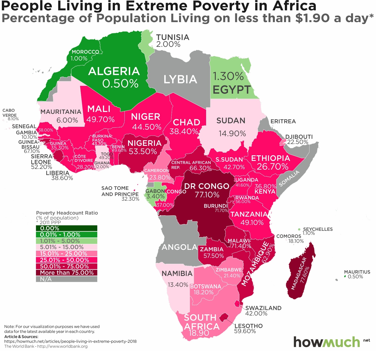
 It’s clear that the one continent with the most extreme levels of poverty is Africa. There are only five countries on the entire landmass where less than 5% of the population lives in abject poverty, and in fact most places have levels well over 25%. The only group of green countries is clustered to the north along the Mediterranean, notably the ones closest to Europe and furthest from the heart of Africa. The Democratic Republic of Congo (77.1%) and Madagascar (77.6%) are at the epicenter of global extreme poverty. They are the 2 poorest countries on the planet, where it’s far more common to find someone living on less than $2/day than not.
 There’s no better continent to illustrate the differences between the global North and South than Asia, but the 2 countries deserving special consideration here are China (0.7%) and India (21.2%). China has pursued an aggressive modernization effort under authoritarianism and one-party rule. By contrast, India is a democratic republic also undergoing a massive transformation. And according to PwC both countries will have economies larger than that of the United State by the year 2050. We’ll have to wait and see how the ongoing trade spat with President Trump changes these dynamics (or not).
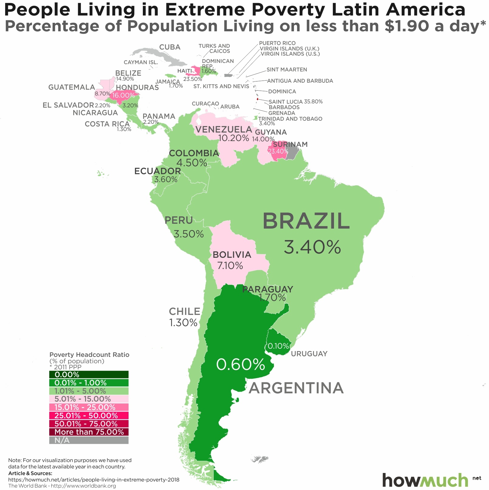
 South America also has an interesting story to tell. Keep in mind, the World Bank’s numbers are the latest available, which means 2015 or even 2011 for some countries. We mention this because the situation in Venezuela has rapidly deteriorated over the last few years with about 2 million people fleeing the country and inflation hitting 200,000%. Surinam (23.4%) and Honduras (16.0%) also stand out as pockets of deep poverty in the Western Hemisphere, and in fact many of the people in the caravan of migrants heading to the United States through Mexico originated from Honduras.
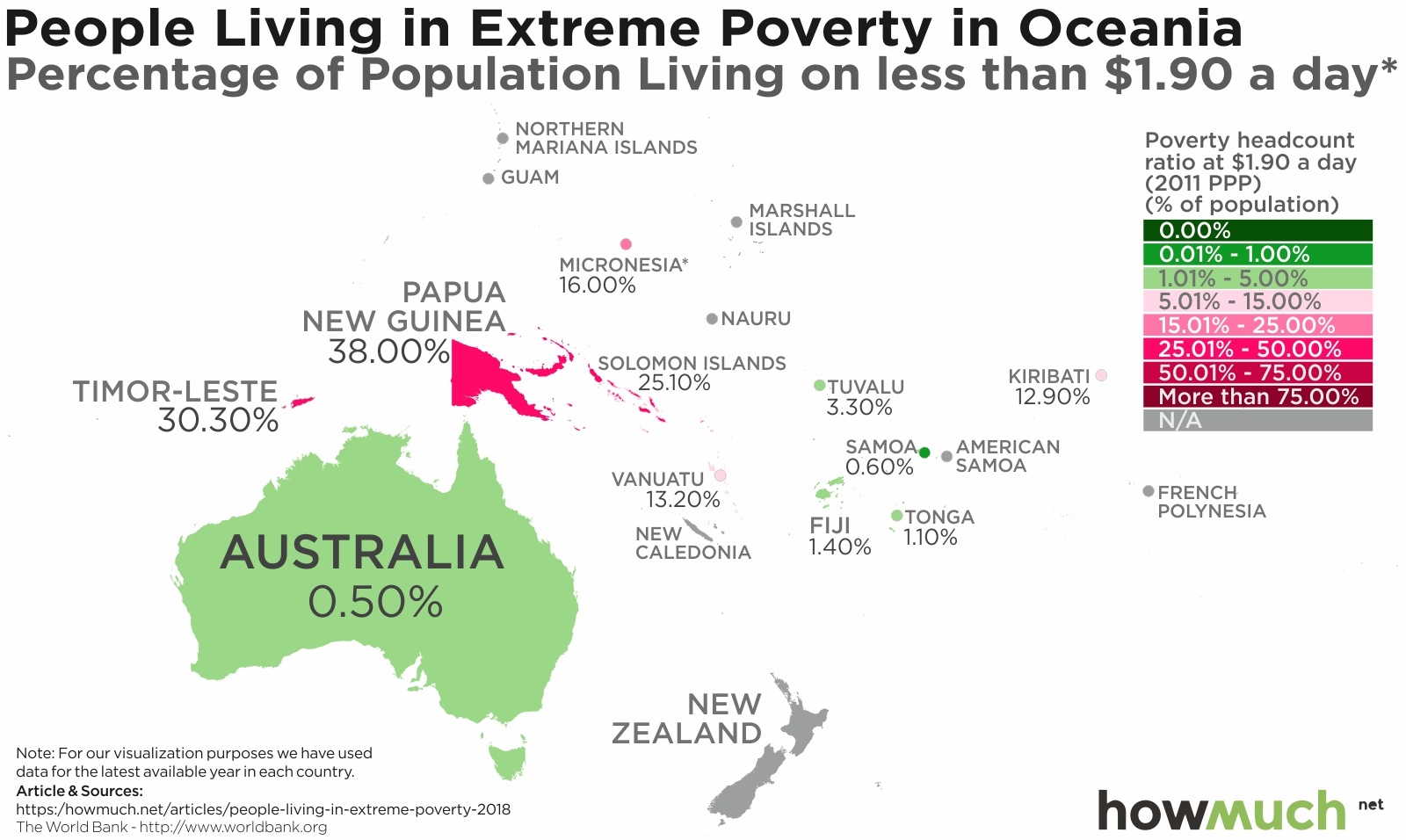
 Skipping across the Pacific Ocean to Australia, we find a developed English-speaking country in Australia (0.5%) very close to countries in abject poverty like Papua New Guinea (38.0%) and Timor-Leste (30.3%). That being said, Australia generally has far friendlier immigration policies than other developed countries, so much so that one could say it has an “immigration economy.”
 The winners in the global economy today are the same countries that colonized places life Africa and South America years ago. Indeed, the world looks decisively different in Western Europe, where only one country, Romania, has more than 5% of its population living in extreme poverty. Almost every country has fewer than 1% living in such a condition, and many report 0.0%. Social democracies with developed economies and rich in natural resources—there’s no wonder why so many immigrants want to move to the West.
 And lastly, consider North America, where the rate of extreme poverty declines the further north one travels from Mexico (2.5%) to the United States (1.2%) and Canada (0.5%). There is actually an interesting comparison here, which is to say that the United States is proportionally home to more people subsisting on $1.90/day than China (0.7%). That being said, there are substantially more extremely wealthy people in the US than any other country in the world, not to mention the world’s largest economy at $19.4 trillion.

